10 min read
By
Abhishek
Google's Identity Problem
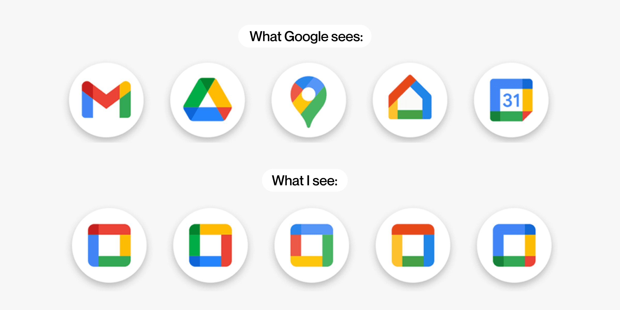
For years, Google had a rule for all its app icons: use the same four colors. Red, yellow, green, blue. Every single app. Gmail had them. Drive had them. Calendar had them. Meet had them. It was the Google way.
The new icons break that rule.
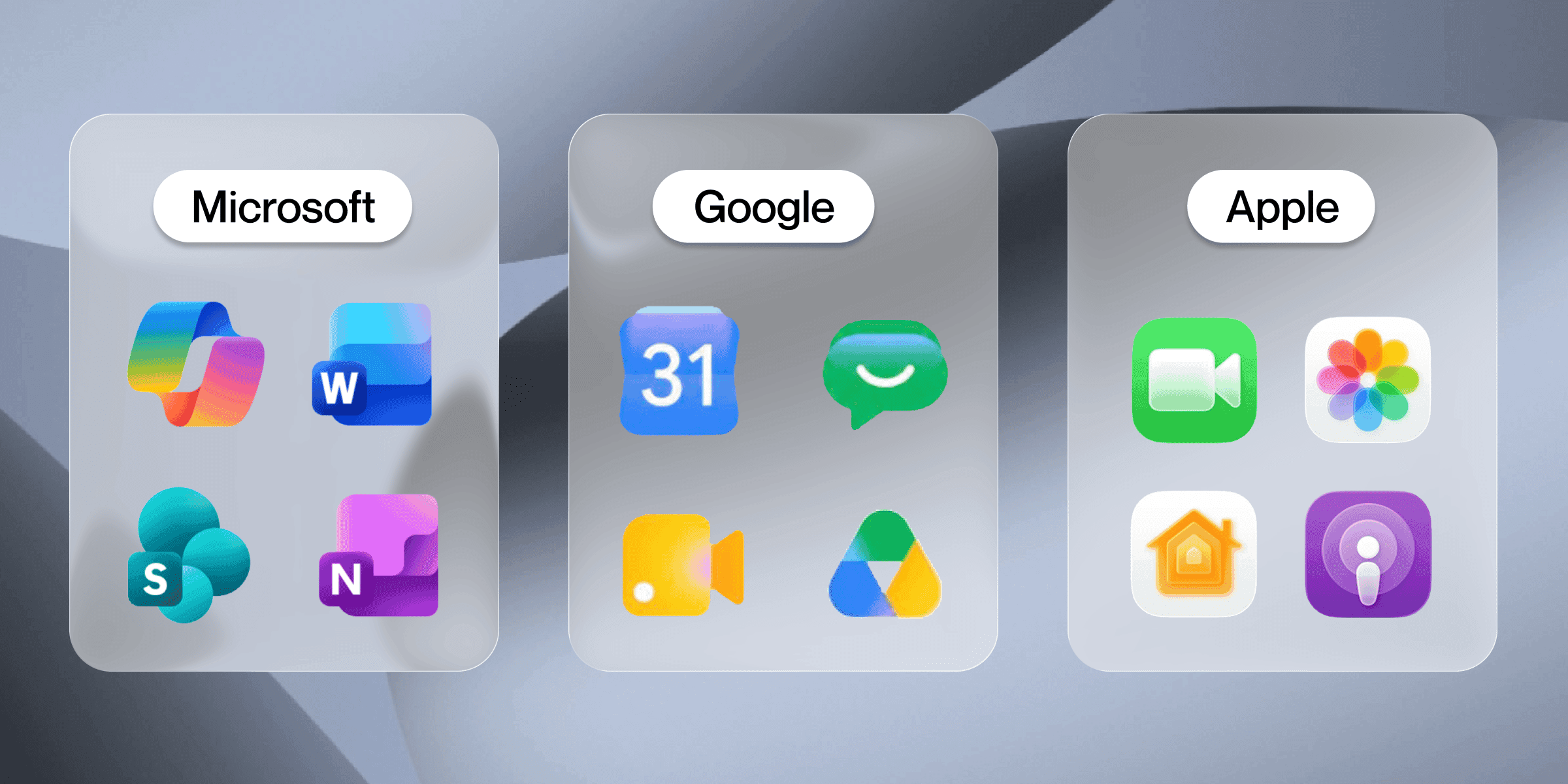
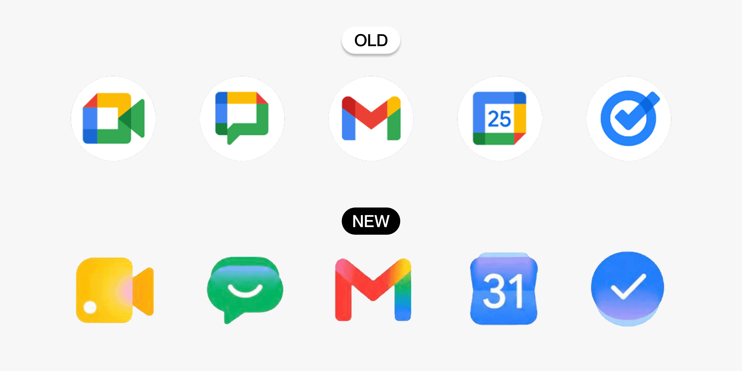
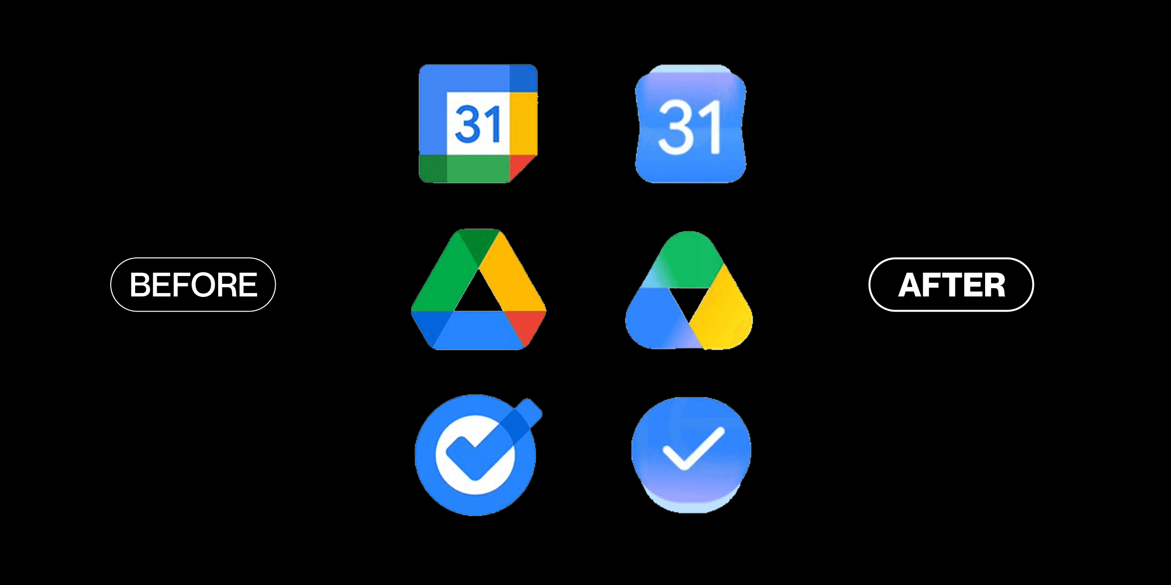
Instead of spreading four colors across every icon, each app now gets one main color. Gmail leans into red. Drive keeps its colorful triangle but feels more distinct. The shapes are bolder and easier to tell apart. Some icons still have a quiet nod to Google's classic colors, but they no longer run the show.
 |
Why the Old System Was Becoming a Problem
When Google only had a handful of apps, the four color system was brilliant. You'd see those colors and instantly think: Google made this. Clean, smart, consistent.
But then Google kept making more apps. And more. And more.
Now there's Gmail, Drive, Docs, Sheets, Slides, Meet, Chat, Calendar, Forms, Keep and that's just the work apps. When every single one of them uses the same four colors, they start blending together. You stop reading the icons and start relying on muscle memory just to find the right one.
The system that once made Google look unified started making it look like a mess.
 |
What the New Icons Fix
The fix is actually pretty smart. When each app gets its own color, your brain can find it faster. You're not decoding a pattern anymore you're just looking for red (Gmail) or blue (Calendar). It takes less effort. Less time. Less frustration.
The shapes help too. More distinct outlines mean even a quick glance is enough. You don't need to stare. That's good design doing its job quietly in the background.
 |
This redesign solves a real problem. But it also gives something up.
The old four colour system was distinctly Google. Nobody else looked like that. You could spot a Google app from across the room. That kind of instant recognition is genuinely rare and genuinely valuable.
The new icons? They look a lot more like… everyone else. Microsoft's apps use this style. Plenty of other software companies do too. One dominant color, soft gradients, friendly shapes. Google is starting to blend into that world.
There's also a smaller issue - gradients can look a bit muddy on small screens. The old flat, bold colors were sharp and clear even at tiny sizes. Some of the new icons feel like they haven't fully decided what they want to be yet. Not quite flat, not quite three dimensional. That in between feeling makes a few of them look slightly unfinished.
Google made its apps easier to tell apart. but in doing so, made Google itself a little harder to spot.
It's the right fix for the wrong reason. because the real question was never which icon is which. It was always: when you see it, do you know it's Google?
For a long time, the answer was an obvious yes. Now, it's a little less certain.
 |
The Forward Updates
Google just made Gemini actually more useful. You know the drill. You spend twenty minutes getting Gemini to write the perfect report. Then you copy it, paste it somewhere else, and watch the formatting fall apart. Fun.
That's done now. Gemini can create PDFs, Word docs, Excel sheets, Google Docs, Slides, and more - directly inside the chat. No switching apps. No reformatting. Just ask, and download.
It sounds like a small thing. But if you use Gemini for work, it genuinely changes how the tool feels. Less like a chatbot you extract things from. More like a workspace where things actually get finished.
The feature is rolling out to all Gemini users starting now.