6 min read
By
Abhishek
The Purpose of Rebrand - Etsy, Amazonia and a few design updates

We’ve been thinking about starting this for a while. The idea is simple, every time something interesting happens in branding or design, instead of just looking at how it looks, we try to understand why it happened in the first place.
So for this one, I want to talk about two recent rebrands. On the surface, they look completely opposite. One feels big, expressive, and very clearly designed. The other feels subtle, almost like nothing much has changed. But if you look a little deeper, both are solving very specific problems.
Before getting into them, one quick thing. Rebranding is usually misunderstood. People think it’s about change or making something look better. It’s not. A rebrand usually happens when something underneath isn’t working properly anymore. The design is just the output. The work is figuring out what needs to be fixed.
 Source - futurebrand.com |
Now, Let's talk about Amazonia
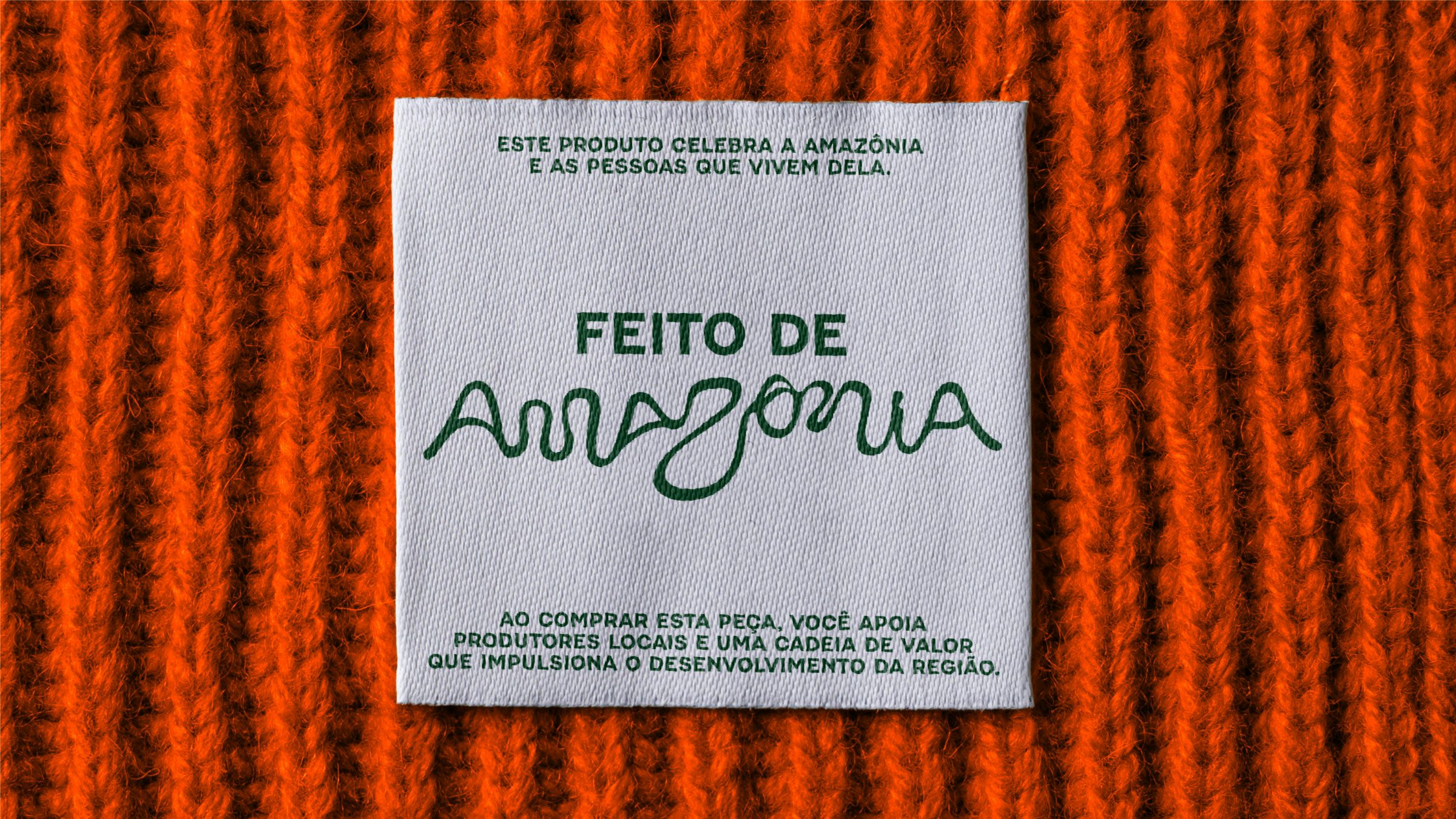
This is something that didn’t exist before. You’re looking at a region that includes multiple states, hundreds of cities, and millions of people, all without a single unified identity. So the problem here is very clear, everything is all over the place.
What they have done is build a brand that can bring all of this together. The interesting part is how they’ve done it. The logo itself is drawn from the curves of actual rivers in the region. Those forms are then turned into a typeface. The whole system expands into colours, illustrations, and different elements that represent the culture, nature, and people. Even the way they’ve involved local artists and credited them tells you this is not just all about visuals. This is about creating something that people can actually use and build on.
There’s also a “Made of Amazonia” seal that can be used across products from crafts to food to music, which gives everything a shared identity and origin. So naturally, it looks rich. It looks detailed. It feels like a lot of work went into it, because it had to. It’s building something from scratch.
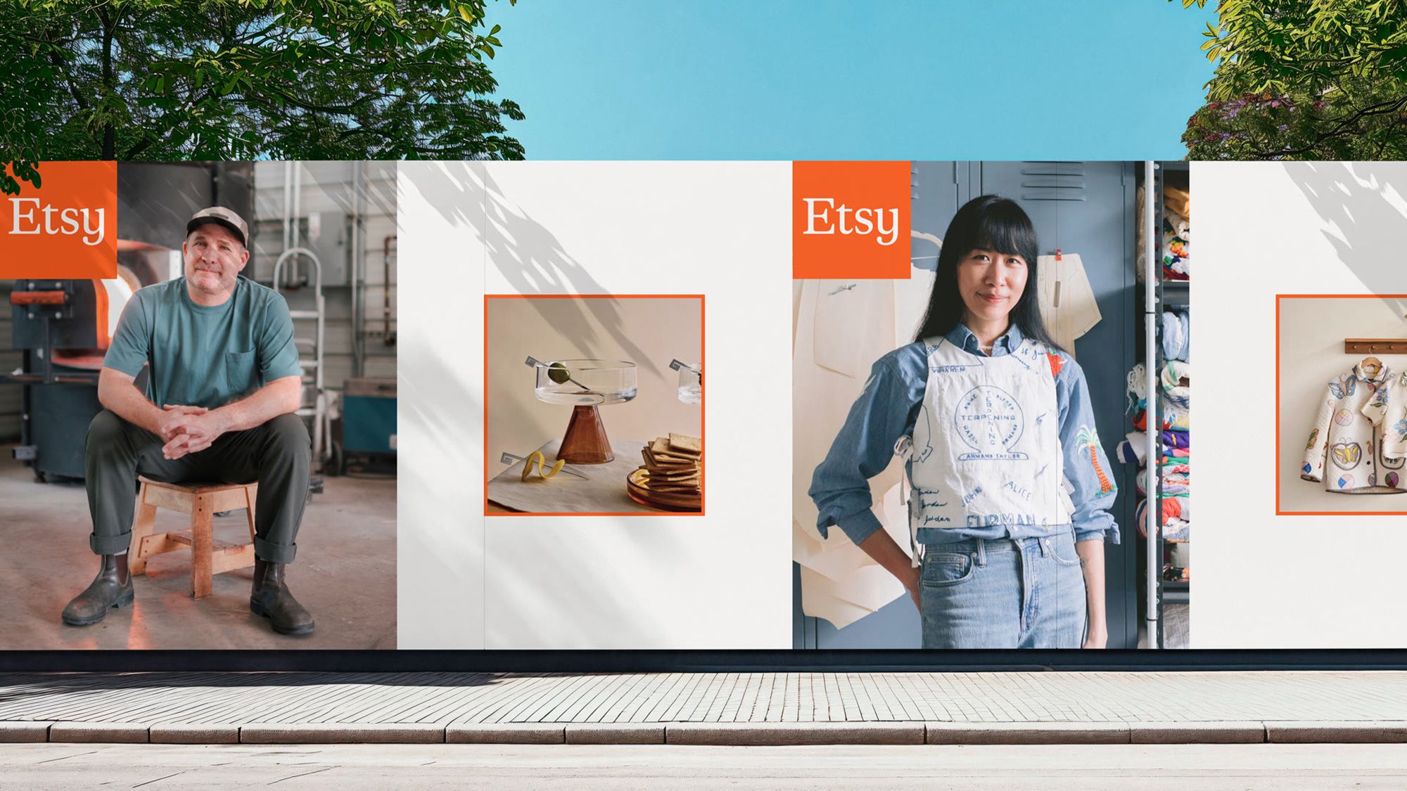 |
Now Let's compare that with Etsy.
Etsy already has a strong identity. It already works. Millions of sellers, millions of products, and a system that people are familiar with. So the problem here is not that they need a new brand. The problem is balance.
When you have that many sellers and that much variation, things can start to feel inconsistent or messy. But at the same time, that variation is exactly what makes Etsy valuable. You can’t just clean everything up and make it uniform. So what they’ve done is much more controlled. They’ve introduced a square system that acts like a container. It helps bring structure without forcing everything to look the same. The wordmark has been refined to feel softer and less rigid.
From the outside, it might look like a small update. When you’re working on something this complex, making a small change is not simple. It means you’ve studied the system enough to know exactly what to adjust without breaking what already works. So even though it doesn’t look like a massive effort, there’s a lot of thinking behind it.
Now let's come back to the main point.
At a glance, both of these might look like the same kind of work. But they’re not. Amazonia is building a single identity for something that never had one. Etsy is adjusting a system that already works, without breaking it. If you only look at how they look, it’s easy to say one is better. But that’s a shallow way to judge this kind of work. But this isn’t about how much you can see. It’s about what needed to be solved. Sometimes the answer is to build something expressive and visible. Sometimes the answer is to step in, fix what’s needed and leave the rest alone. And honestly, that second one is usually harder. It takes a lot more clarity to know what not to change. Most of the real thinking sits there in the decisions you don’t notice and that’s usually where the actual strategy is.
The Forward Updates
DaVinci Resolve 21 just came out and it’s clearly pushing beyond video into photo editing as well along with a bunch of AI features. Figma is getting a bit more complicated on the pricing side, more bundling, more push towards annual plans while also adding new features and integrations. Canva is making aggressive moves, especially with how they’re positioning their tools against Adobe.
And if you zoom out, one thing is becoming clear. The tools are changing fast, but the output is moving in the opposite direction, more human, less polished, less perfect. So whatever you’re building right now, it has to last beyond the tools you’re using.
That’s it for this one.
Thanks for reading all the way through, really good to have you here.
If you think this might be useful to someone, feel free to share it with them. And if they want to join, they’re always welcome.