Boccone
2025, Cafes and Vibrant Zones

Boccone — a fresh quick-serve concept. We crafted a warm, character-driven identity and a compact packaging language that reads at-speed, photographs well and brings personality to every touchpoint. The system balances wholesome colour, a friendly mascot and clean typography to feel modern, accessible and memorably local.
Boccone came to us with a simple goal: stand out in a crowded fast-casual scene without losing approachability. Their product is comfort food with personality — fries, quick bites and a memorable mascot concept — but the visual language needed tightening: clearer marks, a dependable palette and packaging that works at takeout speed.
Strategy: be bold where you need to be, warm where it matters. We focused on three pillars: readability in motion, character-led warmth, and packaging systems that speed service. That strategy informed palette rules, mascot use and label systems—locking those decisions early prevented the inconsistencies the brand previously showed.

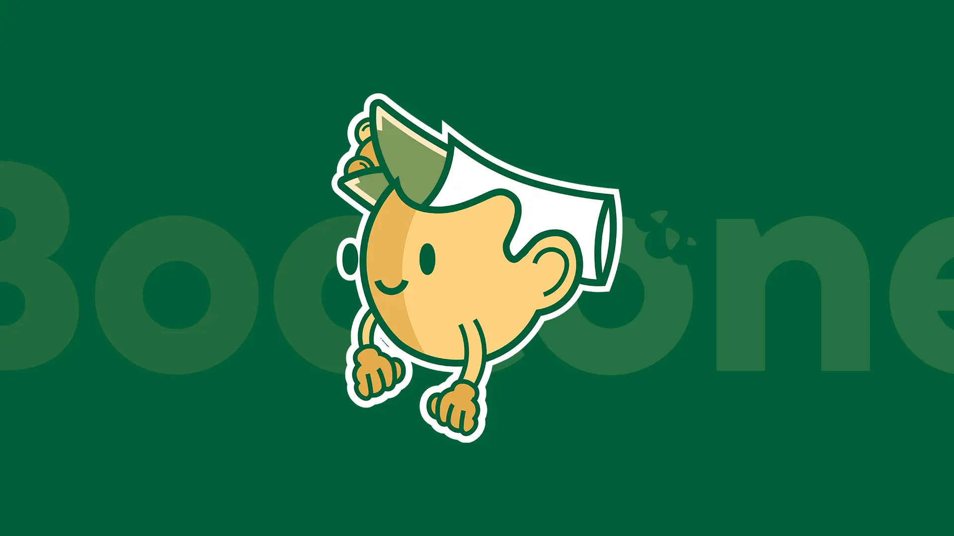
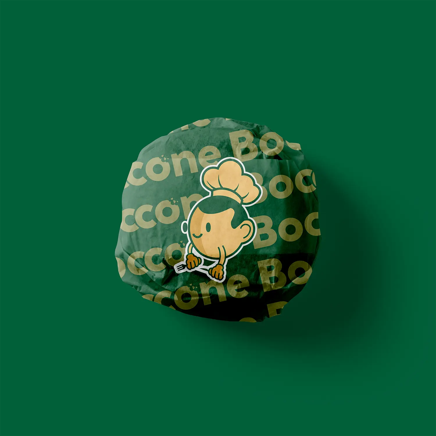
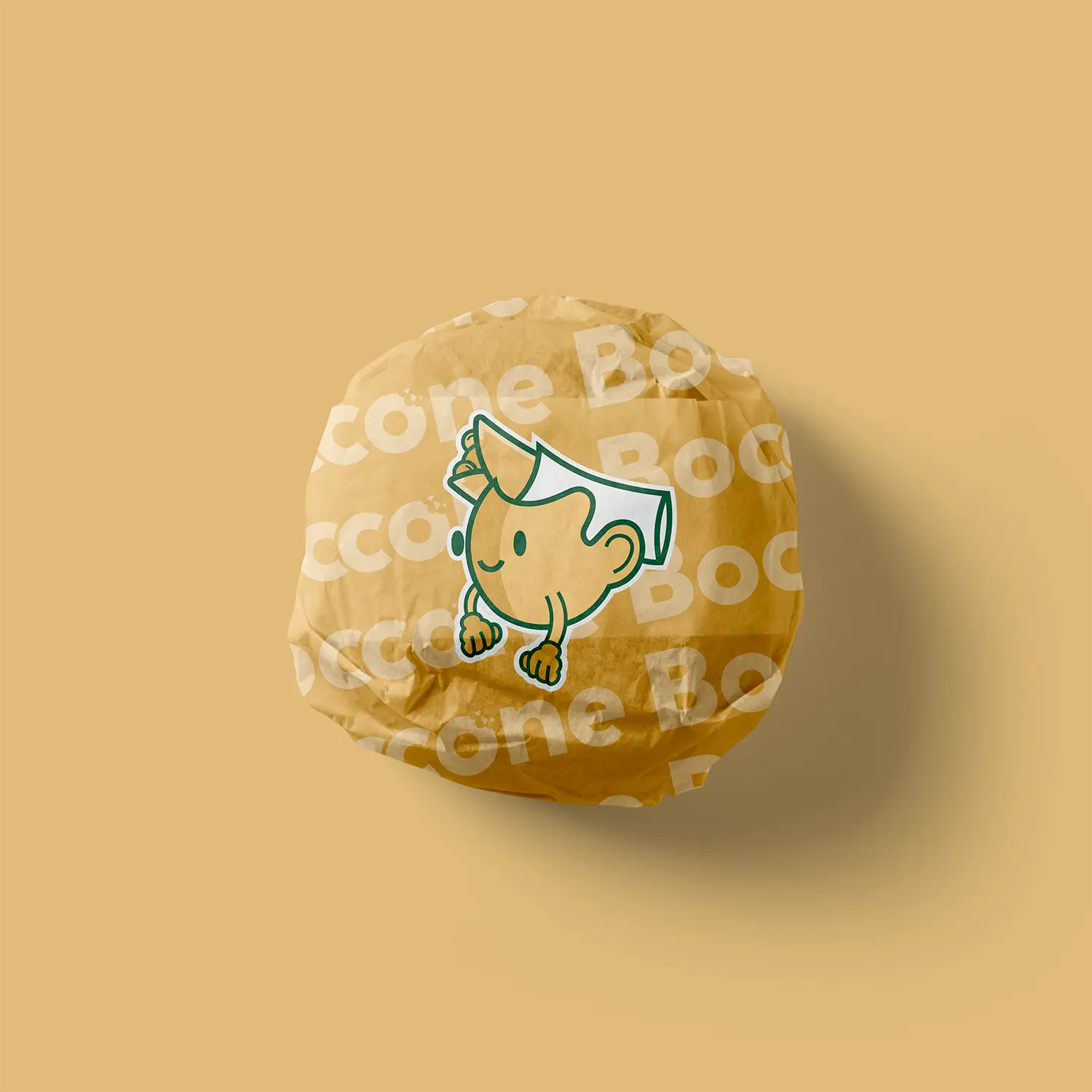
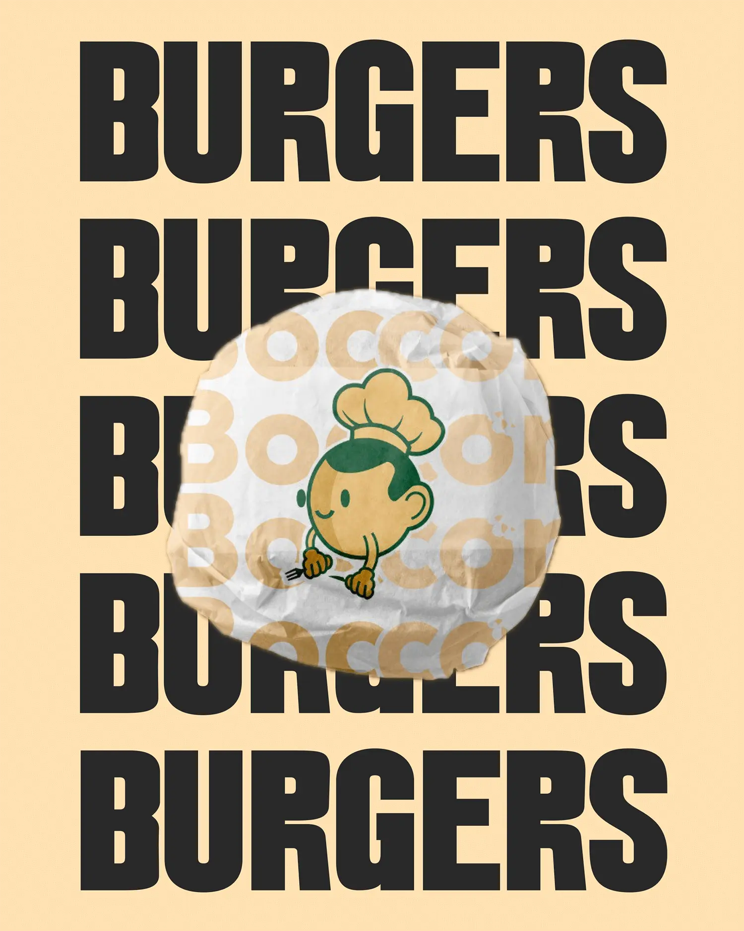
We created a strong wordmark with warm, rounded letterforms and a subtle friendly bump on the ‘o’ to nod to the mascot’s cheeky personality. The mascot (a simple, humanised snack with chef elements) exists as a secondary expressive device — used at scale for packaging and subtly behind headlines for brand recognition without crowding functional touchpoints.
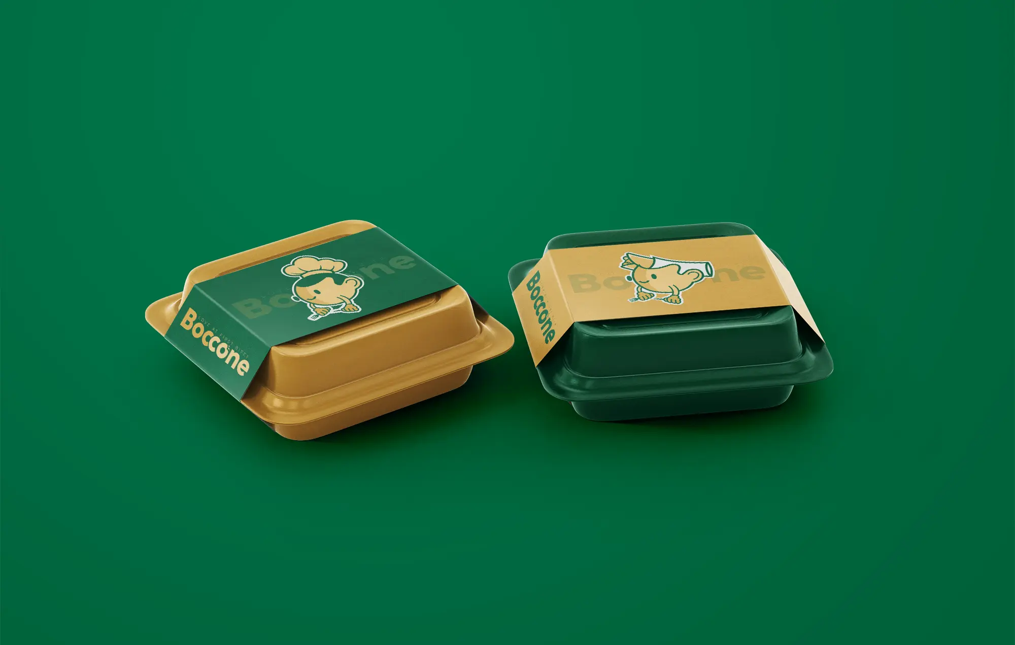
Primary palette is built on warm mustard, deep green and a neutral support — an earthy, appetite-friendly trio that suits both food photography and retail fixtures. Materials favour slightly textured uncoated stocks and matte finishes to keep packaging tactile and food images warm. Merch and staff kit use flat inks for consistency and durability.


Menus prioritise contrast and speed: large headlines, concise descriptors, and a clear price hierarchy. Signage and wayfinding use the primary accent for calls-to-action while neutrals host descriptions and smaller copy. Staff kit keeps the mascot presence minimal — friendly but not distracting.
The brand performs outside the restaurant too — in lightboxes, wayfinding and merch. These context shots show the identity at scale and maintain legibility even when seen in passing.

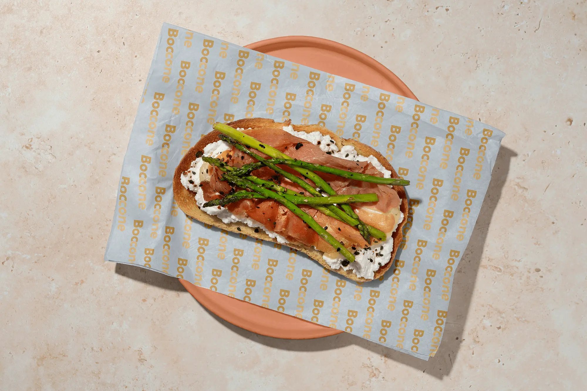
We designed the packaging to feel as satisfying as the food itself. Each wrapper and liner carries a balance of bold patterning and friendly character work, making every product instantly recognizable—whether stacked on a counter or photographed in a flatly. By keeping the system consistent across colors and formats, the brand stays cohesive even as the menu expands.
The playful energy of Boccone really comes alive here. Each wrapper uses colour and illustration to give the product its own character moment—friendly, charming and unmistakably Boccone. It’s a visual rhythm that keeps even the simplest meal feeling fun.
The Boccone identity balances warmth and function: a friendly mascot for charm, a locked palette for consistency, and packaging systems built for speed. The brand now reads clearly across counter, delivery and social — improving recognition, strengthening merchandising opportunities and supporting efficient service workflows.
