Gradure Admission

  • Branding

  • Assets

  • Branding

  • Assets

  • Branding

  • Assets

2025, Education

Hands holding up a Gradure Admission booklet with a bold modern ‘G’ logo on a navy blue cover against a clear blue sky.

At the core of the Gradure brand identity lies a clear vision: to convey sophistication, versatility, and modern craftsmanship across every touchpoint. Our strategic approach began with understanding the brand’s values — what makes Gradure distinct, relatable, and future-ready. Every visual decision, from typography to colour hierarchy, was informed by this core strategy so that the resulting system feels intentional, cohesive, and memorable across both digital and physical environments.

Gradure Admission billboard with the message ‘Your Future, Our Guidance,’ featuring a smiling student holding books and an ‘Enroll Now’ call-to-action in an underground walkway

Discovery & Strategy

10 Days

We explored Gradure’s mission and market landscape, defining its core values — Trust, Progression, and Accessibility — through founder workshops. This foundation guided the design, ensuring it was both visually engaging and aligned with business goals.

Design & Identity

7 Days

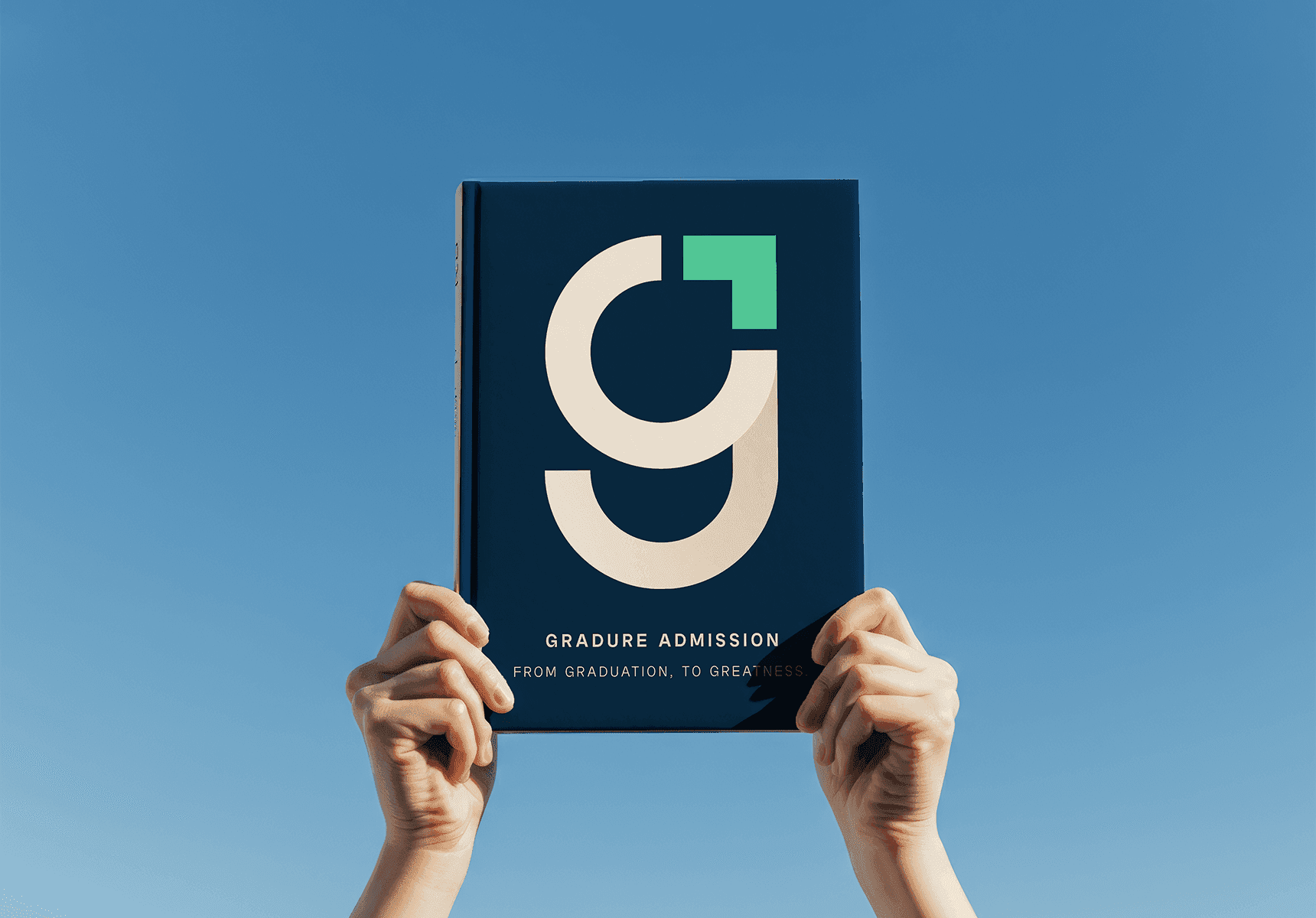
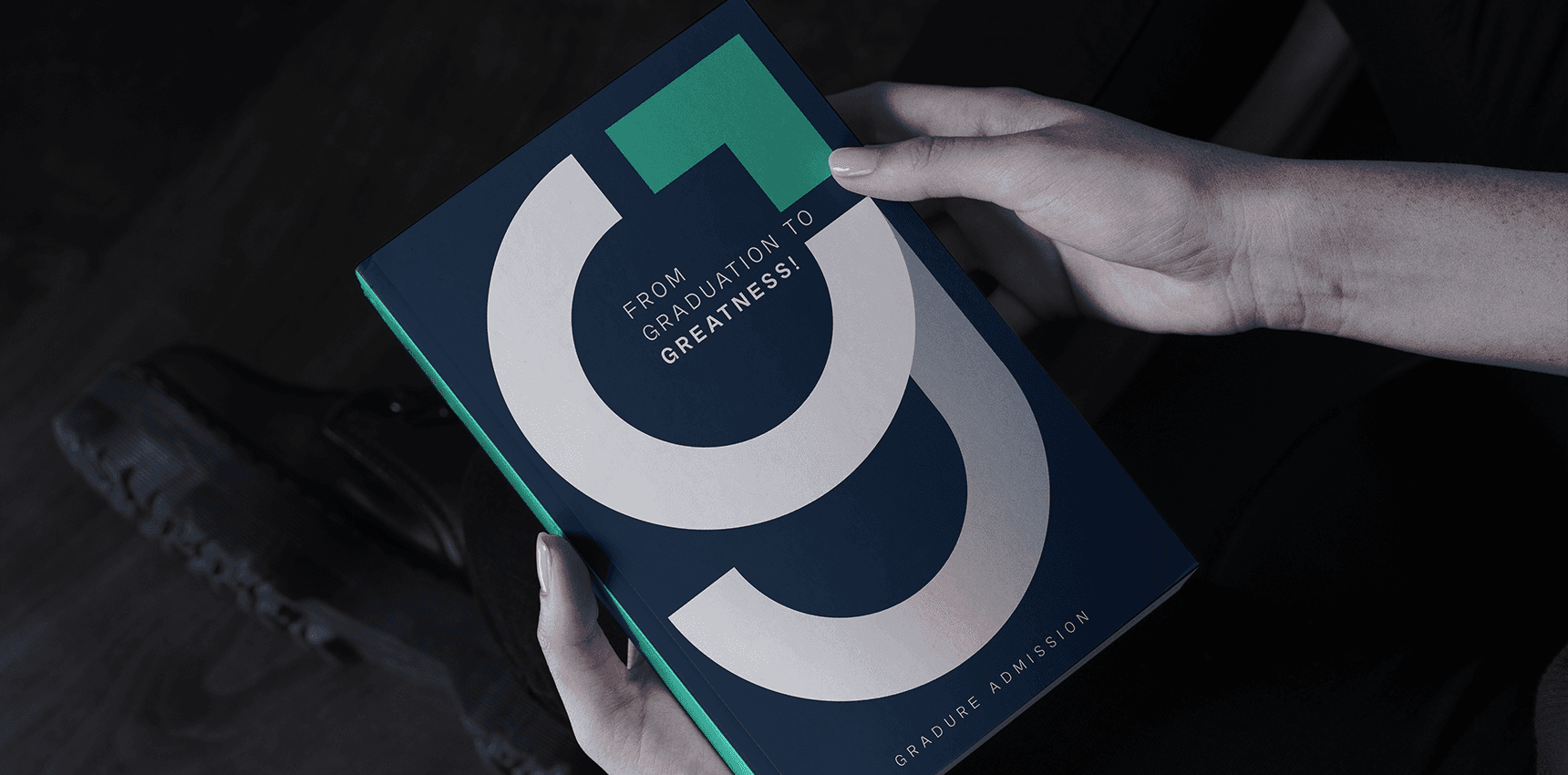
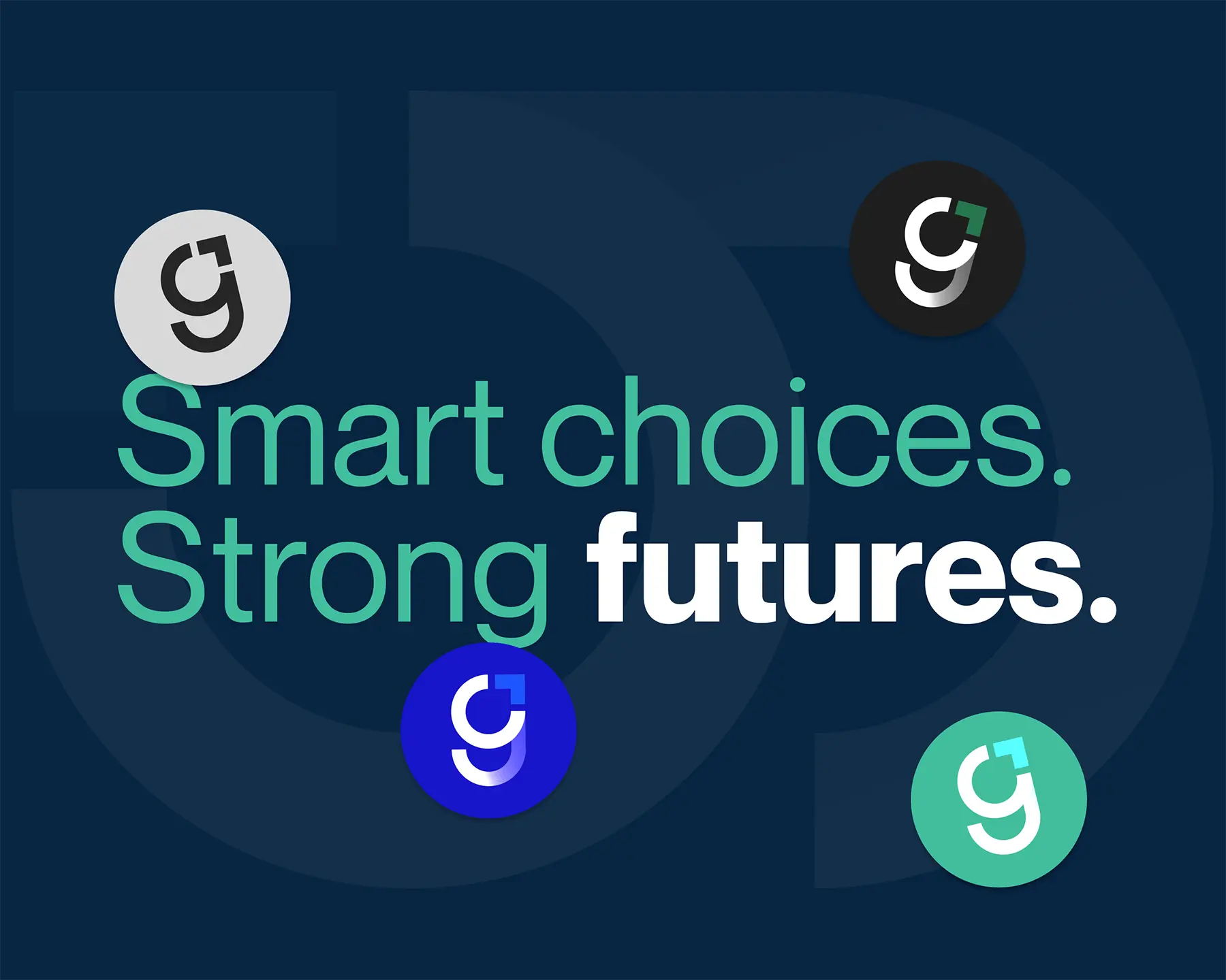
Guided by the strategy, we explored minimal yet meaningful concepts. The final direction—a typographic mark symbolizing the student’s journey—led to a custom ‘g’ logomark, clear color hierarchy, and balanced typography. The outcome is a simple, memorable, and enduring identity.

Related Assets

5 Days

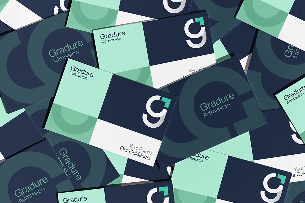
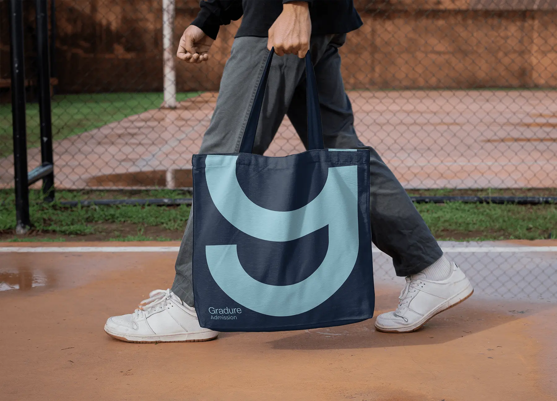
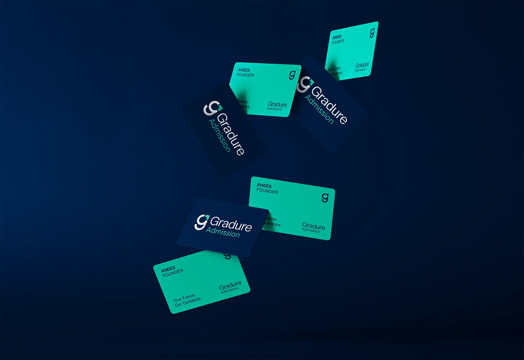
To bring the brand to life, we created key applications - digital assets like social media templates and icons, along with essential stationery. Comprehensive brand guidelines equipped the Gradure team to apply their new identity confidently and consistently across all touchpoints.

Person holding a Gradure Admission booklet with the bold ‘G’ logo and the tagline ‘From Graduation to Greatness’ on a navy blue cover.

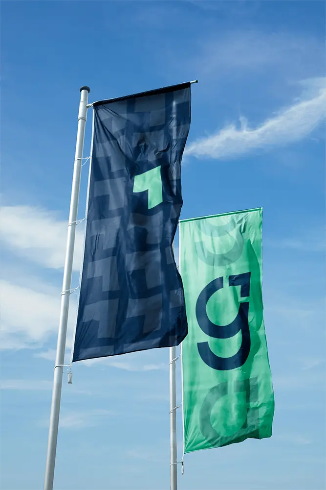
The Gradure logo system reflects a careful balance between timelessness and contemporary flair. By refining the typographic forms and creating a flexible mark structure, we enabled the brand to adapt seamlessly from large-format signage to compact product labels.

The typography was selected not only for its aesthetic harmony but also for its legibility across screens, signage, and printed collateral — ensuring consistency and clarity wherever the brand appears.

Gradure-branded flags in navy blue and green featuring the modern ‘G’ logo, waving against a clear blue sky
Person holding a black Gradure Admission tote bag featuring the bold modern ‘G’ logo against a dark background.
Pile of Gradure Admission brand buttons featuring the bold navy and white ‘G’ logo with a green accent.

Colour plays a fundamental role in elevating Gradure’s visual language. We established a primary palette anchored in warm neutrals and refined accents that communicate confidence and accessibility. Secondary colours and gradients were layered in to provide flexibility without diluting brand recognition. These tones not only enhance the visual hierarchy but also serve as a toolkit for storytelling across consumer touchpoints — from web UI to packaging design.

Gradure’s signature block-shaped pattern in dark blue, featuring one standout mint-green element to highlight brand identity and visual consistency
Large outdoor wall display featuring the Gradure Admission brand message ‘Your Future, Our Guidance.’ in mint green typography over a dark blue patterned backdrop with the signature block icon.
Scattered stack of Gradure Admission brand cards featuring bold geometric layouts in navy, mint, and white, with the signature ‘G’ symbol and tagline ‘Your Future, Our Guidance.’ displayed across various designs.

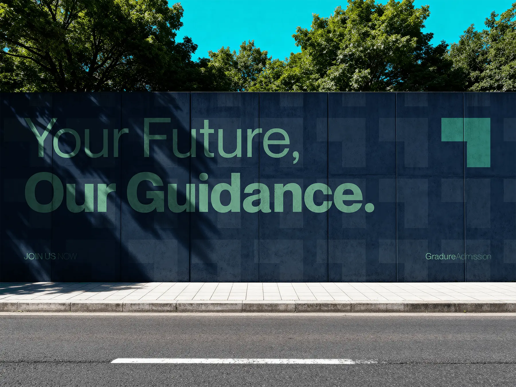
Beyond colour and type, graphic patterns and textures give the brand tactile depth and personality. These visual elements were developed to function as supportive backdrops, packaging motifs, and brand signatures without overpowering core messaging. By thoughtfully integrating pattern work, we created a visual rhythm that enhances engagement while maintaining a clean, professional presentation.

Person walking outdoors carrying a navy-blue Gradure Admission tote bag featuring a large light-blue geometric ‘G’ symbol as the main graphic.
Floating Gradure Admission business cards in teal and navy, showcasing the brand’s minimalist logo and typography against a dark blue background.
Gradure Admission logo centered on a dark blue geometric pattern made of repeating ‘g’ shapes and plus-like motifs in varying shades of blue.
Gradure Admission graphic featuring the slogan ‘Smart choices. Strong futures.’ with multiple circular logo variations displayed on a dark blue background.

Designing an identity is not just about visual appeal — it’s about how experiences unfold in real life. Every asset created for Gradure was tested against real-world scenarios: from digital navigation and merchandising layouts to physical touchpoints like labels, brochures, and point-of-sale displays. This functional lens ensures that the brand system not only looks good but also performs effectively within customer journeys and touchpoints.